Cannabis
Where we started. Author-driven packaging for European cannabis brands, from print-ready file to finished container.
The problem
The extract and flower shelf is crowded with labels that copy each other: same gradient, same dispensary typeface, same icon. A brand built to last needs a signature you recognise from three metres away that survives a growing range without falling apart.
How we tackle it
- The name is drawn as the matter it evokes — pastry for Apple Strüdel, Inca stone for Picchu, a drip for Ghost Breath. Done by the studio, never a template.
- Range system: a run of flavours reads as one family, with colour, grid and hierarchy rules the client can follow.
- Selective holographic (RDG_WHITE layer) — with no white base under the lettering, the letters come out genuinely holographic. No equivalent in Europe.
- Compliance built in: legal notices, weight icons and warning triangles placed from the design, not stuck on afterwards.
What's included
- Side label, side + cap or mylar with author illustration and lettering
- Files ready for Roland print-and-cut (PDF/X-4 + .ai, CMYK FOGRA39, technical layers)
- Application guide for future range references
- Physical packaging quoted separately, with low minimums
- Rights transfer and, if contracted, permanent exclusivity
Work done
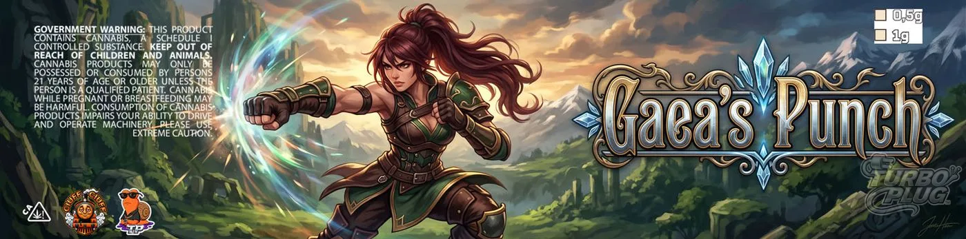
Gaea's Punch
Side label with original fantasy illustration and ornamental lettering with crystal motifs. Legal notice and compliance icons built into the composition.
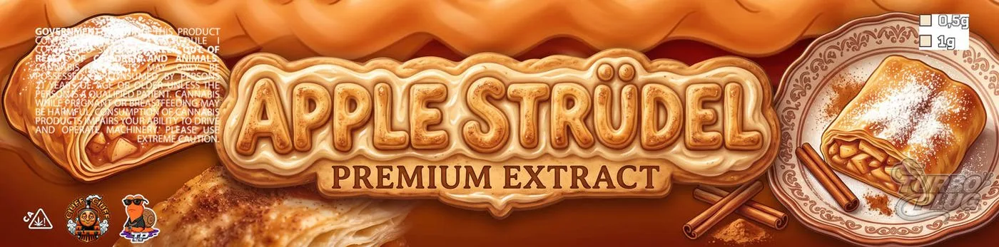
Apple Strüdel
Food hyperrealism — the pastry dough becomes the letters of the name itself. Client commission, approved and in production.
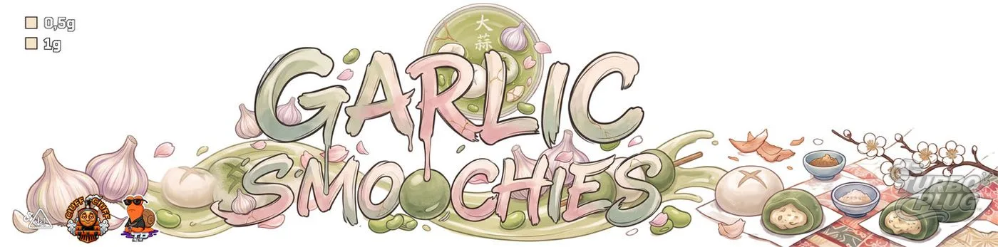
Garlic Smoochies · Broken Garlic
Two pieces from the same family with different author lettering but shared system rules.
Sector questions
- Can you include my country or state's warnings?
- Yes. Send the text and the applicable rules and we place them with the right hierarchy. Legal responsibility for the text sits with the client; the design integrates it.
- Designs with well-known brand names or characters?
- We can work an original style, but we don't replicate third-party commercial imagery, and those pieces don't go in our public portfolio or get sold as catalogue.
- White or holographic vinyl?
- Decided before designing. Realistic food usually works better on white; lettering and graphics shine on holographic. We ask the supplier for a physical sample when in doubt.